No fake guaranteesManual reviewMobile-first clarityClick-focused layout direction
Sample Audit Preview$10 audit
Mini project
Local Gym Video Thumbnail
Goal: make a promo easier to understand on a phone and create a stronger reason to click.
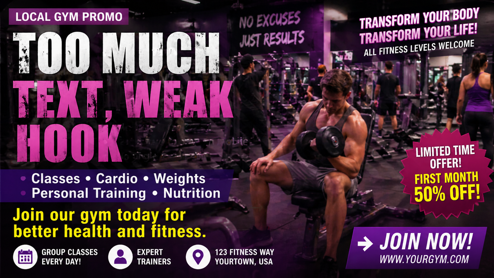
Current Thumbnail
A busy promo that makes the offer feel generic and harder to trust at a glance.
Weak promise: no clear reason to click now.
Text overload: too many words competing for attention.
Low conversion feel: looks more like a flyer than a clickable thumbnail.
→
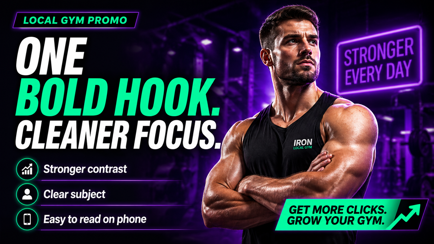
Improved Concept
A stronger business-facing version with a cleaner hook, bolder layout, and premium feel.
Clearer offer: a single strong message leads the design.
Better hierarchy: headline, subject, and CTA are easier to scan on mobile.
More sellable: gives the client a sharper, more professional visual direction.
Included in the $10 audit
Low-ticket entry. High-value clarity.
1 quick audit breakdown with the biggest issue called out first
1 stronger thumbnail concept direction you can use immediately
1 short action plan with cleaner hook, hierarchy, and mobile-readability notes
Need it designed for you?
Turn the audit into a premium next step your customer can say yes to right away.
The audit is the easy first yes. From there, upsell better concepts, done-for-you thumbnails, or monthly visual support.
$10 Audit$25 Better Concept$50 3 Thumbnail Pack$250/mo Visual Support
Fast win:show the problem, then show the cleaner direction.
Business value:helps the client understand why stronger visuals can improve interest and trust.
Easy upgrade:move from advice into done-for-you implementation.
What you get
A fast audit you can actually use.
Clear notes, better direction, and a simple next step without fake promises.
1. Biggest issue
I identify the main thing making your thumbnail or visual harder to understand.
2. Better hook text
You get a sharper headline or text direction designed for mobile readability.
3. Better layout concept
You get one cleaner direction for subject, text, color, contrast, and CTA placement.
Why visuals miss clicks
Most thumbnails fail before the viewer even thinks.
The idea might be good, but if the viewer cannot understand the visual in one second on a phone, they scroll past.
✓ Text readable at phone size
✓ One clear focal point
✓ Background not too busy
✓ Strong contrast and hierarchy
✓ Curiosity or clear benefit
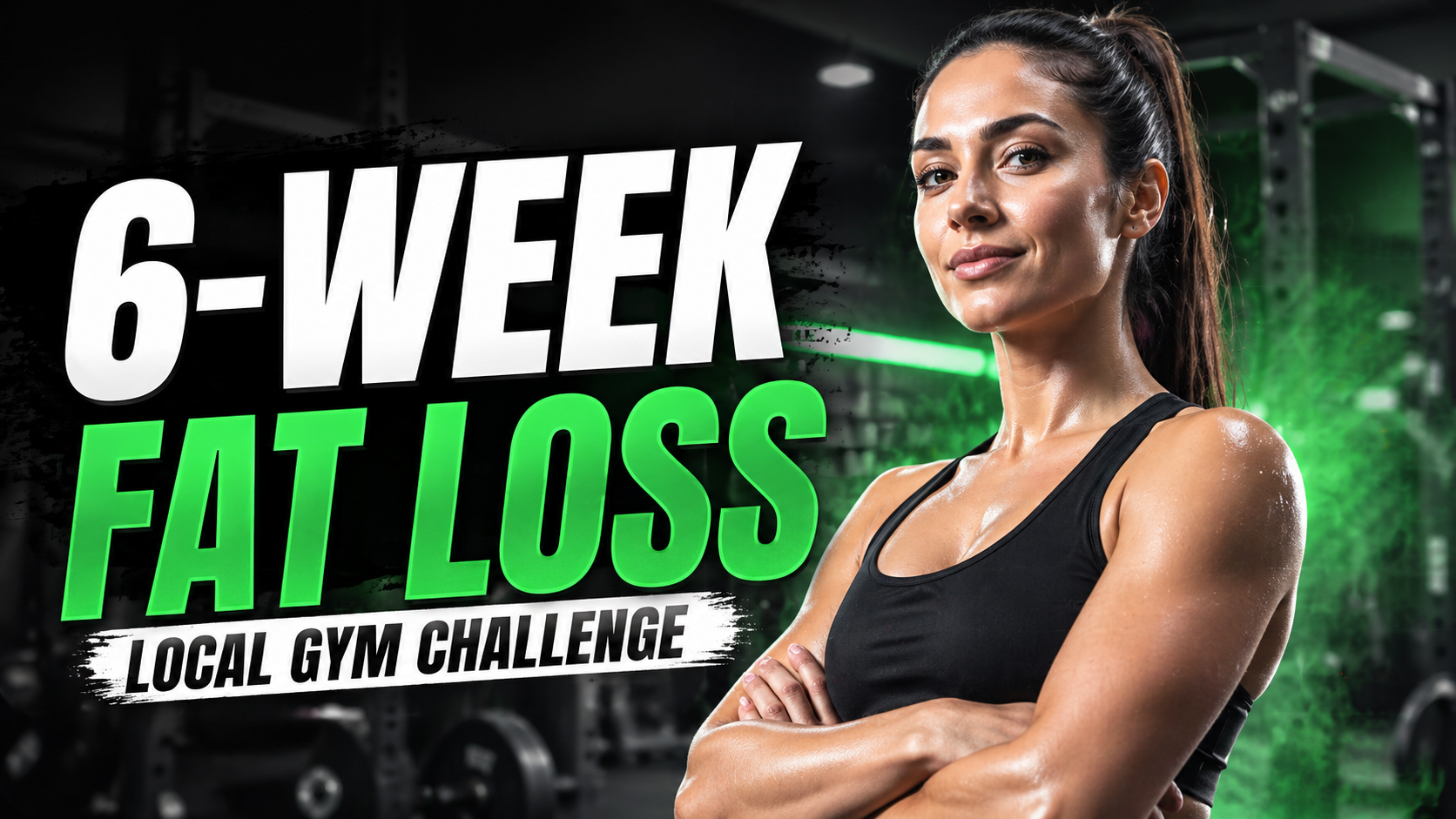
Example work
See the difference: Poor CTR vs High CTR.
Realistic A/B sample thumbnails make the audit offer easier to understand. A shows what hurts attention. B shows the cleaner, more clickable direction.
Example ABusiness
Local Gym Promo
A local business thumbnail can look busy, generic, and hard to trust. The improved version uses one strong promise and a clearer focal point.
A / Poor CTR
Too many offers, too much copy, and no single reason to click.
B / High CTR
One bold hook, stronger subject focus, and faster phone readability.
Best for gyms, coaches, trainers, restaurants, barbers, med spas, and local service businesses.
Shows how a $10 audit can turn into a $50 thumbnail pack or monthly visual support.
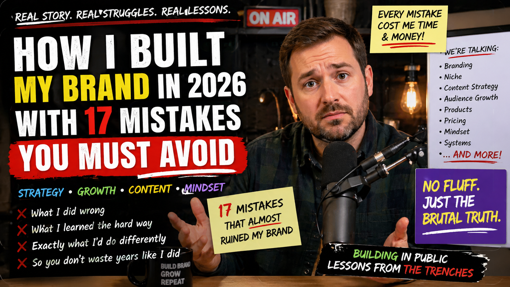
Example BCreator
Podcast / Brand Episode Cover
A creator thumbnail can have a strong idea but lose clicks because the title is too long. The improved version keeps the hook simple and bold.
A / Poor CTR
Long title, overloaded layout, and too many competing messages.
B / High CTR
Shorter hook, cleaner visual hierarchy, and stronger direct attention.
Best for YouTubers, podcasters, streamers, coaches, creators, and personal brands.
Demonstrates that the same audit system works across creator and business niches.
How it works
Simple. Fast. Manual.
01
Send your link
Email your thumbnail, video link, or promo visual.
02
I audit it
I review clarity, hook, contrast, hierarchy, and mobile readability.
03
You get direction
You receive a practical concept you can use or upgrade into finished designs.
Starter offer
$10 Thumbnail / Visual Audit
One thumbnail, video cover, or promo visual reviewed